Royal Mail Hotel: Rebrand
Head approximately 260 kilometres west of Melbourne to the southern tip of the Great Dividing Range and you will discover the tiny township of Dunkeld and, in it, one of the Australia’s finest dining experiences – The Royal Mail Hotel.
Following extensive renovations and the launch of Wickens, their award-winning restaurant, the hotel wanted to create a brand identity that better reflected its new chapter and vision.
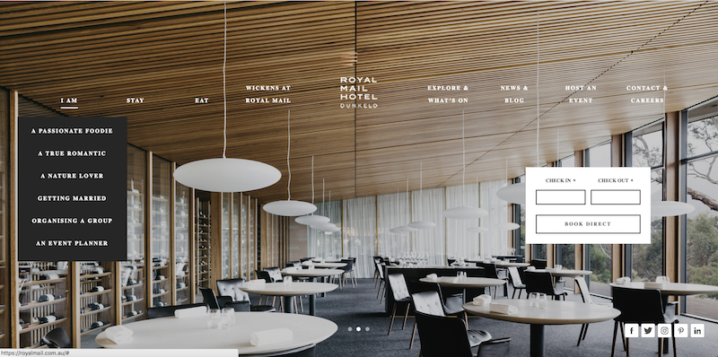
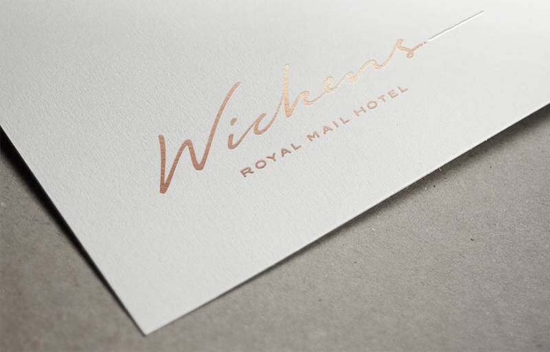
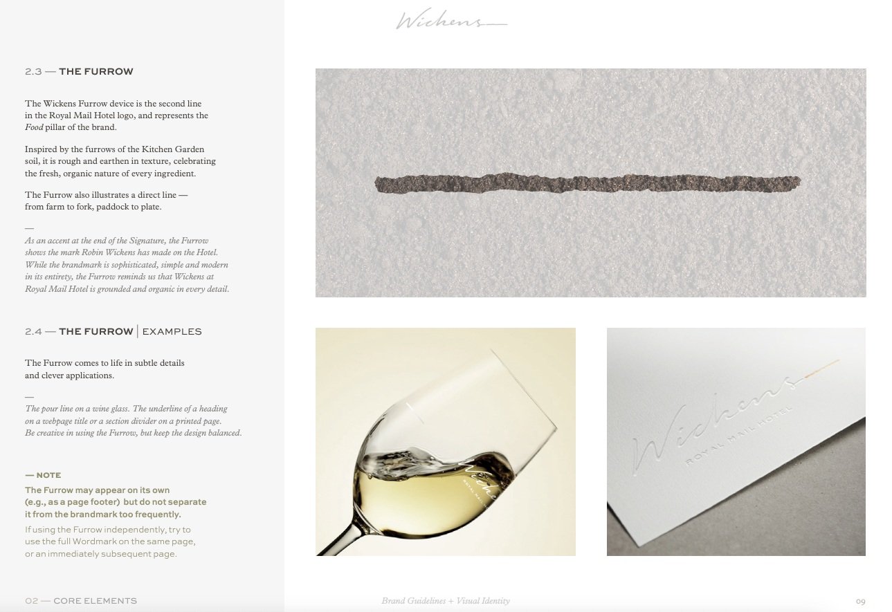
As part of a team of writers, strategists and designers, I worked closely with the client to get to the heart of the hotel’s compelling intersection of food, people, place and wine. We highlighted this with a simple and elegant brandmark, evoking handwriting, garden furrows, a vineyard and a postmark, along with a logotype inspired by a vintage stamp (a nod to the historical postal route that gave the hotel its name). In addition, we also developed an identity for Wickens, created full brand guidelines and rewrote the website to reflect a more powerful and emotional tone.
With this storytelling approach, the new identity confidently communicates the Royal Mail Hotel’s rich history and timeless spirit, while setting a foundation for exciting things ahead.


